
What is volume?
Volume reflects the strength of a cryptocurrency ; the more it is traded , the greater the volume of transactions will be.It is the most useful indicator, along with price, for trading; most other indicators are actually based on formulas for the relationship between price and trading volume.
Furthermore, the higher the volume, the less likely the price is to be manipulated by isolated actors and the more reliable the technical analysis.
Another characteristic of volume is that it is considered to peak before price . This makes it an excellent tool for predicting future movements.
Here's what you should get:
Error in the image : the color of the volumes is determined by the difference between the previous day's close and the current day's close... if the previous day's close was higher than the current day's close, the volumes will be red (even if the session was bullish, i.e. a green candle).
Another characteristic of volume is that it is considered to peak before price . This makes it an excellent tool for predicting future movements.
How to read the volume?
Normally the volume chart should be displayed by default on your exchanges ' charts . It is usually located below the price chart and is represented by a histogram .Settings on Tradingview
Here are the settings I recommend to make it easier to read volume on Tradingview :- Display the volume from the Indicators menu if it is not displayed
- Click on the small cog next to Flight (20) to display the parameters, indicate an MA length of 40 and change the color (not yellow, it's difficult to read).
- Then click on the arrow to the left of the eye and unmerge your volume chart from the price chart (otherwise we will have scaling problems).
- Click the arrow again and do Apply indicator to volume and choose Moving Average , which you will set to 5.
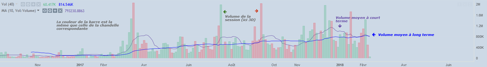
Here's what you should get:
Error in the image : the color of the volumes is determined by the difference between the previous day's close and the current day's close... if the previous day's close was higher than the current day's close, the volumes will be red (even if the session was bullish, i.e. a green candle).
Conversely, if the previous day's close was lower than the current day's close, the volumes will be green (even if the session was bearish, i.e. a red candle). Thanks Michel for the correction!
Reading the volume graph
The graph is quite simple to read, each bar corresponds to the volume of a period of the chosen time unit .Here I chose 3D (3 days) so each bar represents the volume obtained over 3 days. The color of the bar is identical to that of the candle (and not the candle ) which corresponds to it.
The smoothest moving average corresponds to the long-term average volume , this provides a level to know if the current volume is much stronger or much weaker than usual.
The smoothest moving average corresponds to the long-term average volume , this provides a level to know if the current volume is much stronger or much weaker than usual.
The second moving average represents an additional level and smooths out the strong variations displayed by the bars.
The price-volume relationship
Three relationships between price and volume can be identified:- Increasing Volume: When volume increases, the current trend is expected to continue. Volume represents the consensus between parties (buyers/sellers), so the higher the volume a trend has , the more reliable it is .
- Decreased Volume: When volume decreases, the strength of the current trend is expected to weaken. A trend reversal can be expected later, so it is generally not a good idea to enter a cryptocurrency with too little volume.
- Volume spike: We will sometimes observe isolated spikes in volume (also called climaxes ), this often corresponds to compulsive actions on the part of traders who will suddenly buy en masse ( panic buy ) or sell en masse ( panic sell ) following a price movement. The trend is more likely to reverse shortly after.
Example on Ether (ETH)
Here are two examples of climaxes on Ether where sellers " panic sold ", the price stopped its decline from these two volume peaks.We then observe a continuous increase in volume from November, the price also follows, we were therefore in the case of a fairly reliable upward trend.
After December 18, the volume fell sharply but the prices continued to increase very strongly, this could have foreshadowed the decline that followed. We can clearly see that the volume peak formed before the price peak.
When the price exceeds a resistance (breakout) it has a better chance of remaining above the resistance if it crossed it with strong volume.
The first test of the resistance was quite positive, with the rebound registering a short-term average volume of 5,200 BTC, which is twice the long-term average volume.
Volumes and support/resistance lines
When price bounces off support with low volume there is a greater chance that the support will break later.When the price exceeds a resistance (breakout) it has a better chance of remaining above the resistance if it crossed it with strong volume.
Example on Bitcoin (BTC)
Vol MA CT = Average Volume Short Term, LT = Long termThe first test of the resistance was quite positive, with the rebound registering a short-term average volume of 5,200 BTC, which is twice the long-term average volume.
The second test recorded significantly less volume, and buying power weakened.
During the third test, volume did not increase, and as a result, the price broke through the support because there were no longer enough buyers to keep the price at such a level.